Hello there!
As it turns out, I did another mostly-good card for my mom's birthday, so for those of you asking 'How does she do it?' (er, for those of you saying 'why does she bother?' I hate to say it, but your questions will not be answered tonight!) you have a peek at the how. Tags, and everything!
All right, let's get to it.
Step one: Consider subject.
Subject is my mother.
I have a strong, complex, and thoroughly enjoyable relationship with my mother. That's my take, anyway - she may have a different one - feel free to ask her sometime. :-) I know her better than I used to, and still idolize her constantly - flaws and all, she is the woman who showed me what motherhood is - and I spend a lot of time trying to measure up. So, if I'm going to make a birthday card for her, there is All Sorts of Pressure I put on myself. I mean, this is for my Mommie!
What you need to know: she is All About Bling, she should have been a Gibson Girl - she loves the 'bustles, hats, and corsets' look. Her xmas tree is decorated in gold and white, and at 66 she makes retirement look Really stunning - there are women in their 50's who don't look so good! So, below is a sample of my ideas for her birthday card:
Step two: With an Elmer's glue stick, I glued a beautiful b/w tissue to my card stock, front only. (Side note, I determine card dimensions by which envelopes I have on hand, and how complex the card is going to be. This card used up yet another sample from my 7 yr. old wedding stash. If I didn't mention it earlier, the chief reason I make cards is to use up as much of my paper stash and art supplies as humanly possible!) Oh, the other side of the tissue paper was a more saturated black, but that was too distracting, so I used the more greyed-out reverse.
Step three: note (above) the cheesecloth somewhat smooth/draped. I love cheesecloth for softening edges and unifying elements. Mainly, it's serving to soften the b/w contrast, so the topmost elements don't get lost in the rigid structure. I adhered the cheesecloth to the tissue with a thin layer of:

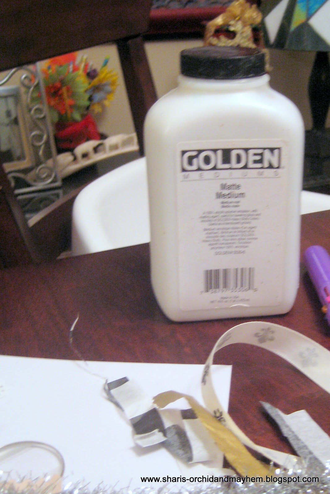
GOLDEN matte medium. No, they aren't paying me. I just friggin' love their products for collage and you should too. Spendy, yes, well, you can do anything with them so spendy is ok. Plus, a little goes forever. I cannot scream enough about how well I love this medium - use it w/ink, watercolor, bones, ANYTHING!. Er, anyway, after I let the medium dry a bit on the cheesecloth (want the adhesive nice 'n stable before further glueing), time to start choosing my elements.
 Will you just Look at the stuff I leave all over the dining room table?
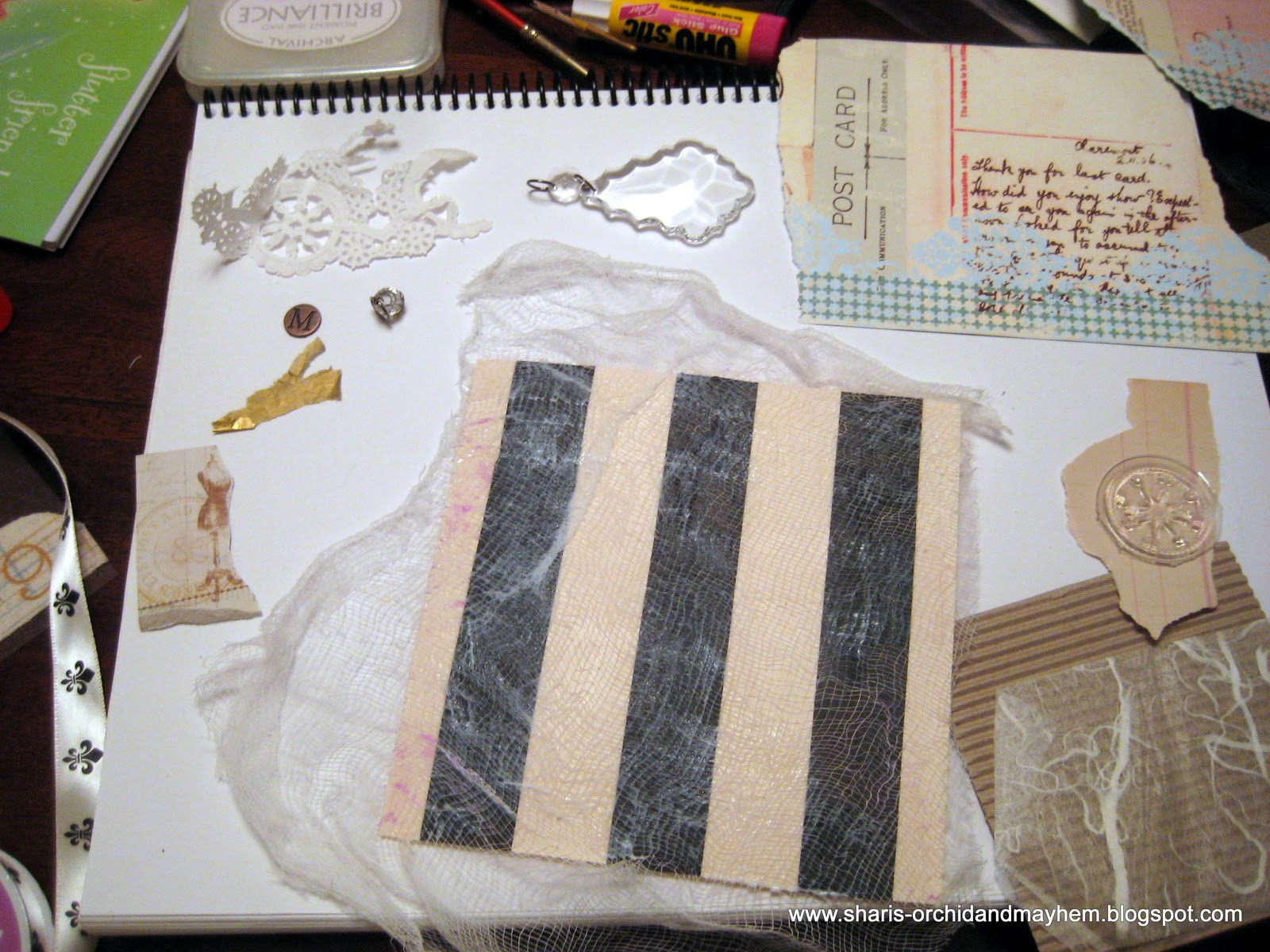
Ok, Her name starts with 'M', so I have a copper coin (memory? hm, can't think of the brand name. Micheal's carries the brand, it's just escaping me now. Black label, if that helps. I'll figure it out when I finish using up the stash and have to buy new ones!) I've narrowed down the other options, canvas strip w/alphabet section, fleur-de-lis satin ribbon, torn gold tissue paper, Tim Holz acrylic crystal pendant (flat And lightweight - yay!) paper doily, cute flower brad, optical lens, scrap of packaging from cute brad (the dressmakers form image, lower left) ledger scrap, and some postal-themed paper stock. Time to start deciding...
Step four: arranging and initial gluing.
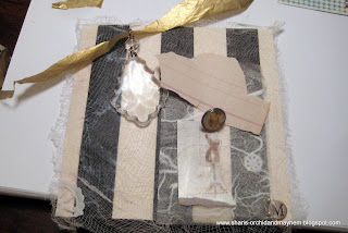 it actually came together pretty quickly. I use the coin in the corner, since the cardstock is almost never as heavy as I like. I so wanted to use the scrap of corrugated kraft paper (top pic), but ultimately it was too busy against the verticals - too much texture and this was getting full. Mom loves yellow roses - that brad immediately became the 'head' of the dressmakers form. Trapped snowflakes behind vellum or rice paper is a favorite visual for me this time of year - those doily scraps balanced out the big ol' crystal opposite. I loved the random shape of the the ledger paper...too bad I didn't know what to scrawl on it!! If you look closely, there's a short strand of pearls around half the M. Those are from a spray on a Godiva sample box, back from my wedding (again. what a pack rat.) M got the glue gun, the peals got Golden!
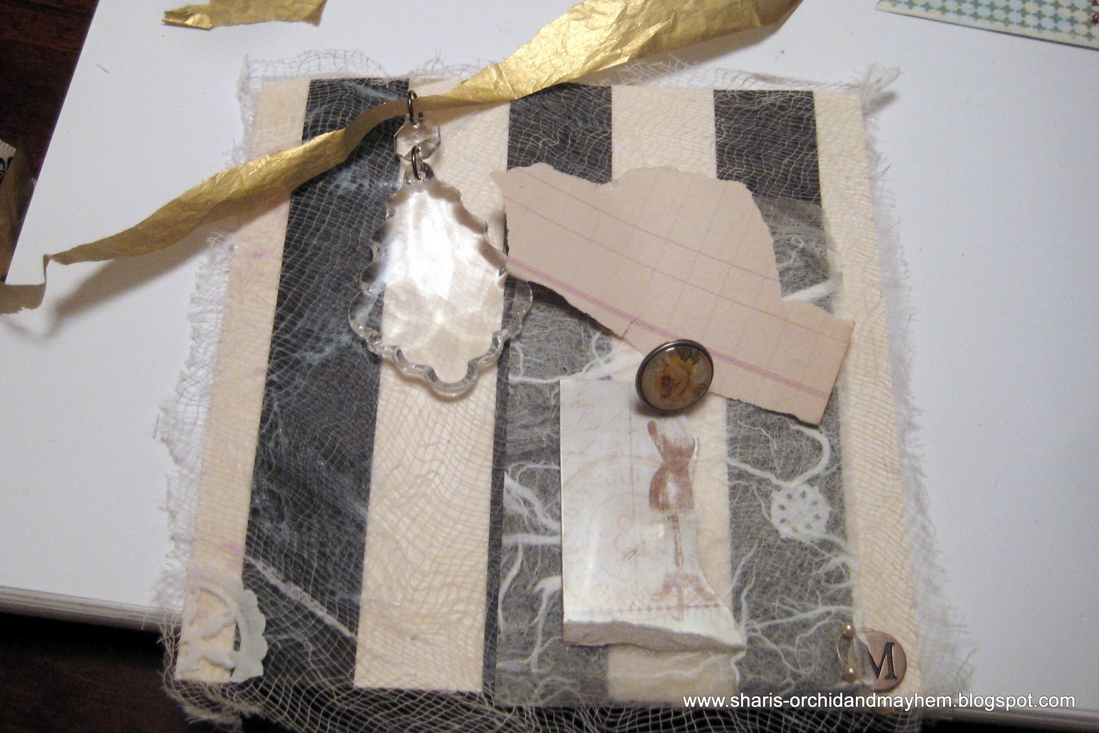
Step 5: what order do they go down again?
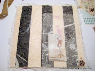
They are too small to see easily, but I do, in fact, have to use pencil marks to outline my layers on the background. Unless I want to dither between a digital shot on the camera and the actual card..... After I had my brief shining moment of fun with the glue gun, I grabbed Elmer again for the thin (look for the purple) layer of rice paper and the paper doily (lower left corner) and the paper snowflake (a bit above the 'M') I think you can still see the medium pooling around the pearls. I trimmed down the cardboard scrap closer to the 'form' image, and glue-sticked that to the rice paper. I also found another strip of vellum to soften the edge of the cardboard, as that was too harsh against the rice paper. Almost done!! (I think I sipped something-or-other at this point....)
Step 6: and.....the writer's block shows up next.
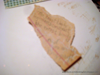 Okay. I wanted to tie the nature of the card to my mother's personality. And her beauty. She is more exotic looking than classic, her skin is gorgeous, her hair is still naturally curly, and her eyes are green. She inherited her dad's 'angular' features and still can turn heads. Between that and her unique fashion taste, I wanted to pay tribute. The muse giggled and offered up something about 'the least likely elements create the rarest beauty' so I had to go with that. (This picture is TERRIBLE. Sorry!!) I was seriously doubting some choices, here, but the crystal was so large and shiny that I Really had to add some material that was un-precious - humble and hokey, even.
Step seven: fire up that glue gun and nail it all down!
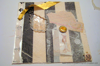 It really was necessary to capture that sentiment (rushed muse and all) because I decided that scrap Needed to be tucked under the flower-brad. Once I did that, the shinyness of the cardboard bothered me, so I used a leftover scrap of vellum (recycling!) to line up with the left side of the flower and soften the scrap. I traced the faint imagery beneath with a brown fine-tipped marker (a relief to not have to dig out the dip-pens!) I stamped a compass (light sepia ink) onto another vellum scrap and set that beneath the position of the crystal. That played off against the light-refraction patterns of the crystal, and I penciled in the '66' to be Quite Visible (anyone making it this far needs to flaunt it!) under the pendant. The whole design was still looking 'unfinished' so I added my gorgeous satin fleur-de-lis ribbon on the left. Damn. Too stark, so - hey, vellum! - and my usual gig of outlining the pattern beneath on the vellum with a metallic pen, (to echo the shine of the ribbon.) That ribbon barely worked, as the glue gun was drying fast that night! I grabbed my cheap gold tissue paper scrap and threaded it through the pendant, glued the pendant first in strategically 'invisible' places for strength, and then positioned and glued the gold paper.
I didn't have the time I wanted to glitz up the envelope, but, well, that will be for next year.
There you have it. That's how I work through making birthday cards. There are undoubtedly smarter, more efficient ways to get through the process, but given All the Stuff i am trying to use up, so far, my method seems to be working.
Beddy by time for me now. You too.Can't start day two of two-twelve with bags under the eyes, right?
Thanks for stopping by, please feel free to comment about this, by the way.( It lacks brevity, I know.
However, it can be accurately said that is the Only thing it's lacking. Look hard, the kitchen sink is in there...)
Somewhere.
I just know it......
;-)
s.
As it turns out, I did another mostly-good card for my mom's birthday, so for those of you asking 'How does she do it?' (er, for those of you saying 'why does she bother?' I hate to say it, but your questions will not be answered tonight!) you have a peek at the how. Tags, and everything!
All right, let's get to it.
Step one: Consider subject.
Subject is my mother.
I have a strong, complex, and thoroughly enjoyable relationship with my mother. That's my take, anyway - she may have a different one - feel free to ask her sometime. :-) I know her better than I used to, and still idolize her constantly - flaws and all, she is the woman who showed me what motherhood is - and I spend a lot of time trying to measure up. So, if I'm going to make a birthday card for her, there is All Sorts of Pressure I put on myself. I mean, this is for my Mommie!
What you need to know: she is All About Bling, she should have been a Gibson Girl - she loves the 'bustles, hats, and corsets' look. Her xmas tree is decorated in gold and white, and at 66 she makes retirement look Really stunning - there are women in their 50's who don't look so good! So, below is a sample of my ideas for her birthday card:
 | ||
| See? White, gold. Bling. I knew she liked the b/w touches from the ballet-instructor card. Wish I'd had time to grab pics of that one too! |
Step three: note (above) the cheesecloth somewhat smooth/draped. I love cheesecloth for softening edges and unifying elements. Mainly, it's serving to soften the b/w contrast, so the topmost elements don't get lost in the rigid structure. I adhered the cheesecloth to the tissue with a thin layer of:
GOLDEN matte medium. No, they aren't paying me. I just friggin' love their products for collage and you should too. Spendy, yes, well, you can do anything with them so spendy is ok. Plus, a little goes forever. I cannot scream enough about how well I love this medium - use it w/ink, watercolor, bones, ANYTHING!. Er, anyway, after I let the medium dry a bit on the cheesecloth (want the adhesive nice 'n stable before further glueing), time to start choosing my elements.

Ok, Her name starts with 'M', so I have a copper coin (memory? hm, can't think of the brand name. Micheal's carries the brand, it's just escaping me now. Black label, if that helps. I'll figure it out when I finish using up the stash and have to buy new ones!) I've narrowed down the other options, canvas strip w/alphabet section, fleur-de-lis satin ribbon, torn gold tissue paper, Tim Holz acrylic crystal pendant (flat And lightweight - yay!) paper doily, cute flower brad, optical lens, scrap of packaging from cute brad (the dressmakers form image, lower left) ledger scrap, and some postal-themed paper stock. Time to start deciding...
Step four: arranging and initial gluing.
Step 5: what order do they go down again?

They are too small to see easily, but I do, in fact, have to use pencil marks to outline my layers on the background. Unless I want to dither between a digital shot on the camera and the actual card..... After I had my brief shining moment of fun with the glue gun, I grabbed Elmer again for the thin (look for the purple) layer of rice paper and the paper doily (lower left corner) and the paper snowflake (a bit above the 'M') I think you can still see the medium pooling around the pearls. I trimmed down the cardboard scrap closer to the 'form' image, and glue-sticked that to the rice paper. I also found another strip of vellum to soften the edge of the cardboard, as that was too harsh against the rice paper. Almost done!! (I think I sipped something-or-other at this point....)
Step 6: and.....the writer's block shows up next.
Step seven: fire up that glue gun and nail it all down!

I didn't have the time I wanted to glitz up the envelope, but, well, that will be for next year.
There you have it. That's how I work through making birthday cards. There are undoubtedly smarter, more efficient ways to get through the process, but given All the Stuff i am trying to use up, so far, my method seems to be working.
Beddy by time for me now. You too.Can't start day two of two-twelve with bags under the eyes, right?
Thanks for stopping by, please feel free to comment about this, by the way.( It lacks brevity, I know.
However, it can be accurately said that is the Only thing it's lacking. Look hard, the kitchen sink is in there...)
Somewhere.
I just know it......
;-)
s.
No comments:
Post a Comment